
You need a website that works on a phone
Responsive web design makes sure that your website displays properly to all users, no matter what screen they are using (desktops, tablets, and phones). The concepts of responsive web design have been around for quite a while and started to be more widespread starting in around 2009. Only the bigger companies were able to accommodate mobile users because it was still expensive to implement. Plus back then, it wasn’t important for most businesses to care about people using their phone to view their website.
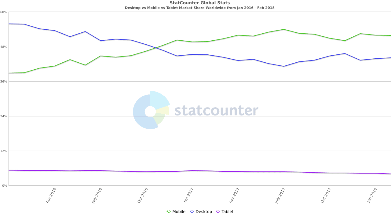
On average, more users are accessing websites with their phones vs their desktop … Since 2016
Yes, that’s correct. So what does your website look like on a phone? The best way to check is to just look at your website on your phone. You can also use this resource to check. If your website isn’t functional for mobile users, then contact us today to see what your best options are for a responsive website.
Google Search uses mobile-friendliness as a ranking signal
Not sure how many of your users are on desktop, mobile, and tablets?
HNC Digital recommends using Google Analytics for all website analytics. They have reports that will show you the breakdown of your traffic so you can see for yourself how many of your users are using their phones to look at your website. If you want more information on how to implement Google Analytics or if you need help with reading Google Analytics reports, then please contact us. We would be happy to help guide you to ensure that you’re able to make business decisions based on how users are using your website.